
space craft
re-imagine “coHab” into a bold brand that will foster a more sustainable future with walkable cities.

OVERVIEW
Space Craft needed a brand that would tell bold, unapologetic, stories. Stories to get attention and change lifestyles for a more sustainable future. I worked closely with the CEO and Director of Operations to create the identity system from the ground up. It includes a logo, color palette, presentation templates, graphic elements, iconography, illustration and the rules around them. I worked with the developer to create the website today.
role
Brand Designer
Illustrator
the logo
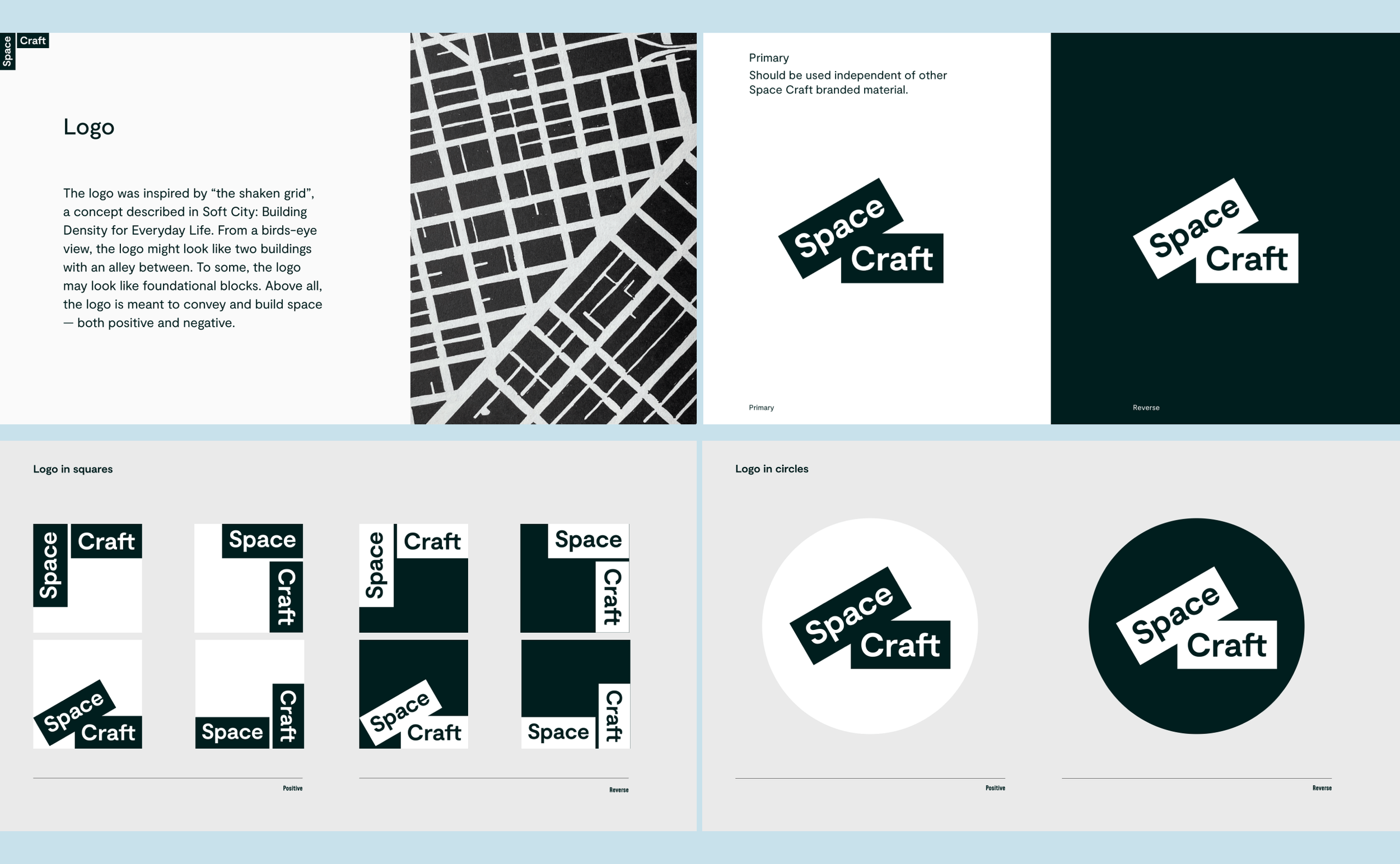
more than a few colors
The main color that serves as the brand foundation is black. On top of this foundation, colors reign in dynamic combinations that proved to be a fun visual identity challenge.

walk the line
Writing the rules around these brand elements proved to be more poetic than a more corporate brand. (Say, compared to writing rules for Karat). The line element helped tie all elements — photography, color blocks, illustrations —together.

Website
Here are some of my favorite vignettes from the website.


illustration
Illustration became a key brand asset. I drew a few “city folks” to show the people living in walkable cities. I was also inspired by rudimentary graffiti. These elements worked wonderfully with social media banners and profiles.

“The design is fresh, interesting, playful, thoughtful, and goal-oriented. It allows us to stand out in a crowded playing field, as we look to attract investors, talent, and customers. Working with Renee was also a delight - she is a productive collaborator through the strategy and scoping process, a willing design iterator till we feel like our brand goals are accomplished, and confident in offering perspectives (and counterpoints) based on her expertise. Our design is better not only because of her creativity, but also with her partnership.”
Investor deck
The goal was to express the brand as reliable and professional without losing the “funkiness” inherent to the brand. The walking “line” graphic element helped thread the deck together.

business cards
Who doesn’t love tasty business cards on thick card stock?

credits, thank yous, and shoutouts
Mohit Shewaramani, Harrison Tucker of Space Craft