covergirl: part I
Dear Reader,
Let's talk about book covers.
Annihilation
By the time you read this, I will have finished reading Annihilation by Jeff Vandermeer. The story is a bleak Lovecraftian journey filled with mysterious prose exploring self destruction, both physical and metaphorical. The movie is a visually stunning interpretation of unsettling sequences featuring demon bears, floral humanoids, and a disturbing recreation of Lucy and Harpo Marx's mirror dance. But I digress, let's look at the book covers!

Illustration: Eric Nyquist; Design: Charlotte Strick
I haven't seen a triptych this sexy since Bosch. I wish you could feel it too. The letters are embossed in a shiny black ink while the illustration lives and breathes on the substrate above. This intertwined relationship between typography and illustration works so well for the story, which describes an alien form of nature infiltrating our own. The illustration is done by the talented Eric Nyquist whose meticulous hand rivals "Where's Waldo" in illustrated maximalism. The cover is composed by successful book jacket designer, Charlotte Strick.
Symphony for the City of the Dead
Before I read "Annihilation", I picked up Symphony for the City of the Dead: Dmitri Shostakovich and the Siege of Leningrad by M.T. Anderson. If you're in the mood to wade through the darkest depths of human tragedy and triumph or are interested in the inextricable relationship between art and politics—read this. It may land you in an existential paralysis, but it's worth it to learn a thing or two. At the very least read what the NY Times has to say about it. But enough heaviness, let's look at that gorgeous jacket!
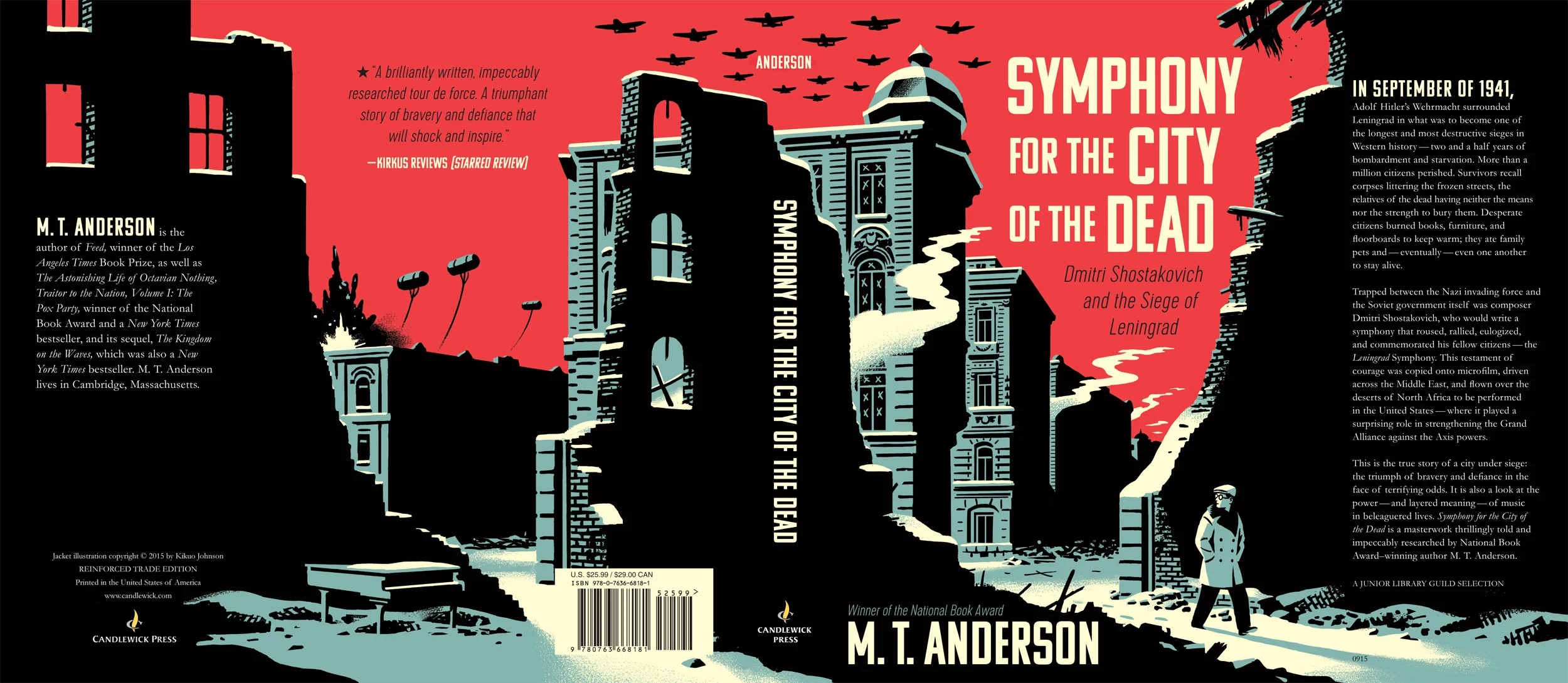
Illustration: R Kikuo Johnson; Art Direction: Matt Roeser
This is great lesson in how effective three colors can be in conveying depth, texture, and mood. The result is a bold, but sensitive snapshot of a character in a perilous environment. And I have to say, I'm so glad they didn't dive head first in the direction of Russian Suprematism or Constructivism. Don't get me wrong, Malevich's Black Square is my favorite painting of all time, but it wouldn't do the story justice here. This cover needed a character to empathize with because this is, ultimately, a story about the will to survive and create along the way. Well done R Kikuo Johnson and Matt Roeser!
Bad Feminist
I haven't finished Bad Feminist by Roxane Gay. So, I too am a bad feminist, and perhaps, a worse reader. This book is witty and necessary, though I wish it wasn't. I wish our culture didn't need a series of essays scrutinizing gender inequality and violence against women, but we do. And we need it clearly stated, centered, bolded, and underlined.

Cover: Robin Bilardello
This book has been accused of a lot of things. Among them, that the cover looks like all the other pink-laden feminist books. Yes, other feminist books have pink, black, and white but I find this one to be the most elegant, the most plain-spoken. It calls attention to itself, the words, the writing, by eliminating all other elements. That classic serif type and its composition is as sharp and academic as Gay's insights. And I like how personal this is. Her name is as big as the self-proclaimed title lest we forget the source of these ideas because, after all, this is a personal examination as much as it is a cultural one. A+ Robin Billardello for this and your other beautiful work!
I hope you've enjoyed this small selection of books I've read so far this year. I named this "Covergirl Part I" because I fully intend to keep choosing books by their cover and sharing that eye-candy with you.
RG+B